Compare year over year
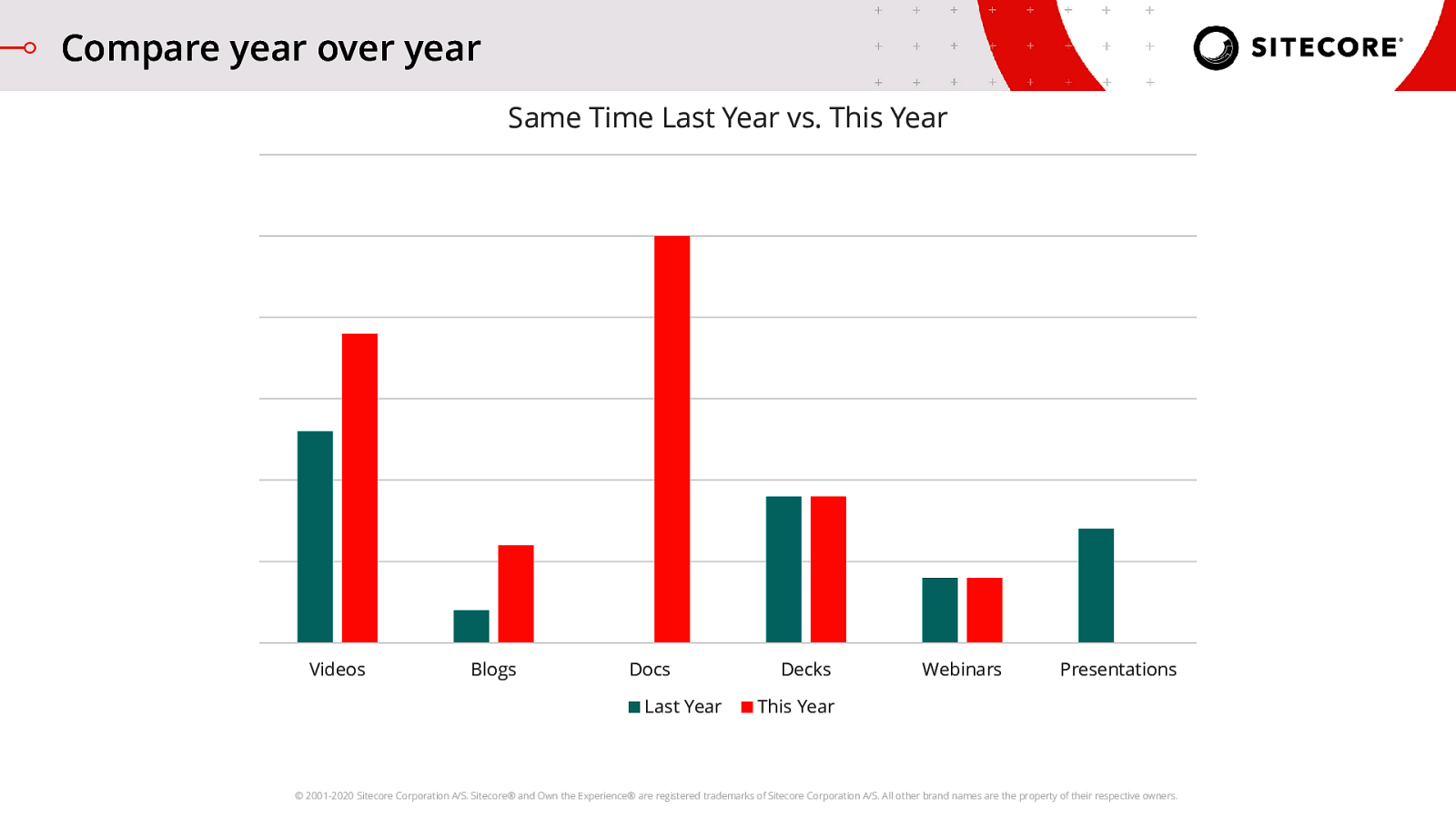
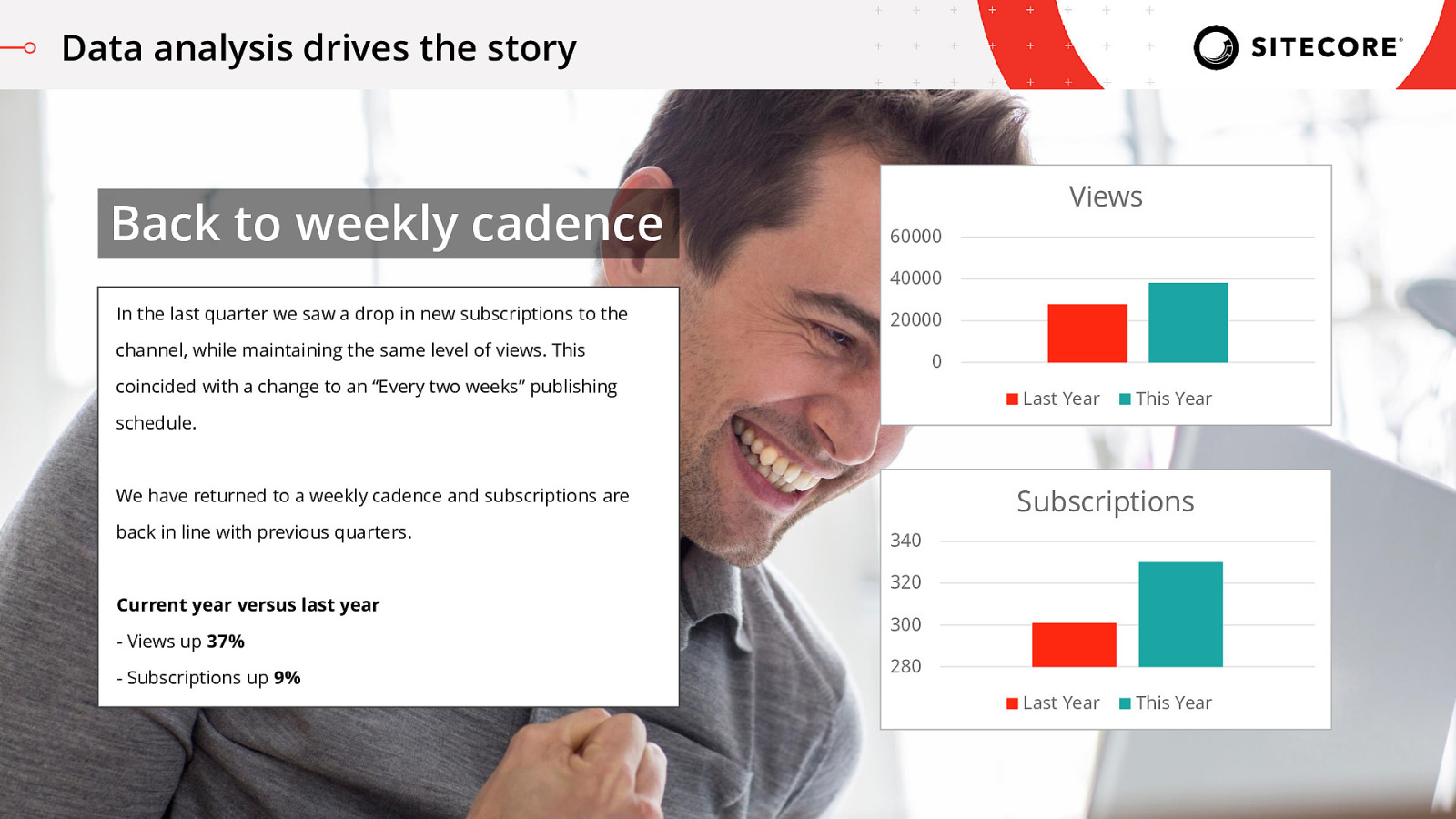
I’ve been doing this a few years now, so now I’ve built up data on this activity year over year. One of the dashboards marketing managers love seeing is comparison against the same period of time from the last year. Were you given a bigger team or more budget to work with this year but your numbers look the same? Why is that?
By comparing year over year, I can eliminate seasonal factors, or recurring ‘happenings’ like events, and get a better look at the current time period’s performance.
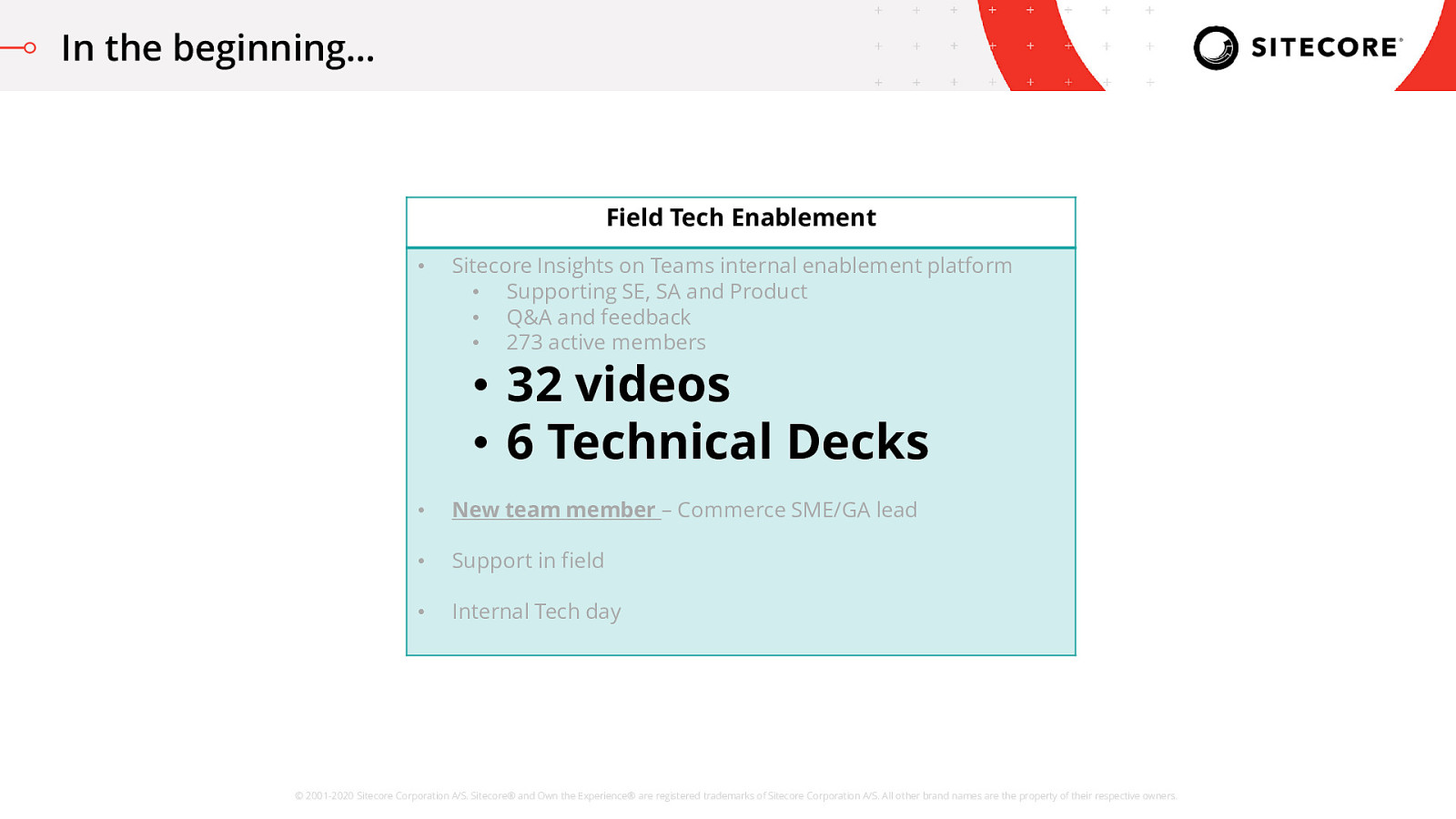
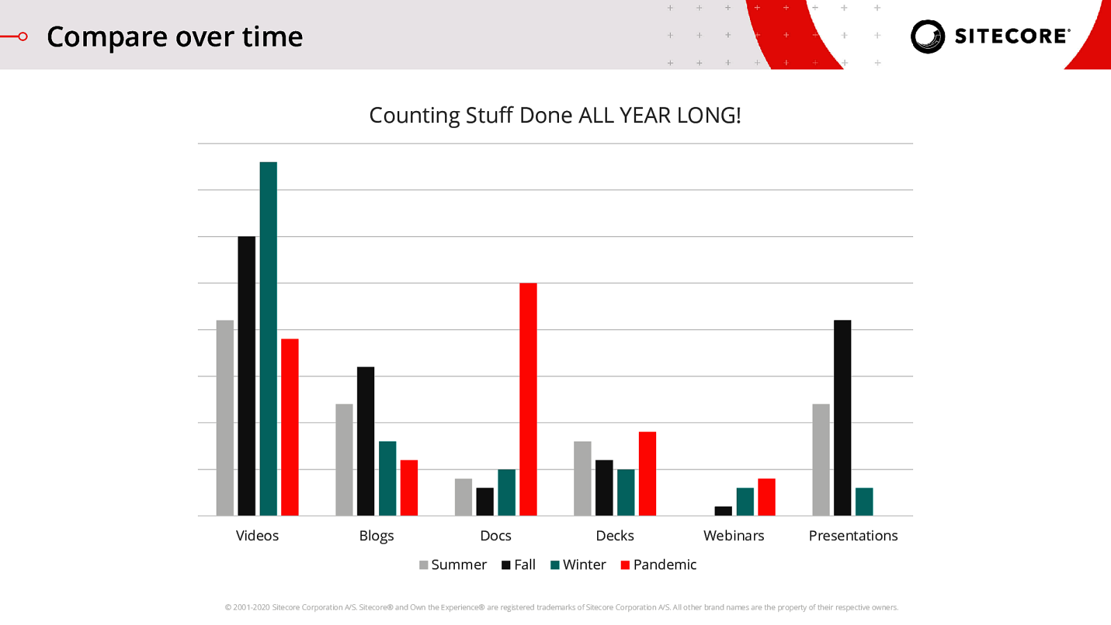
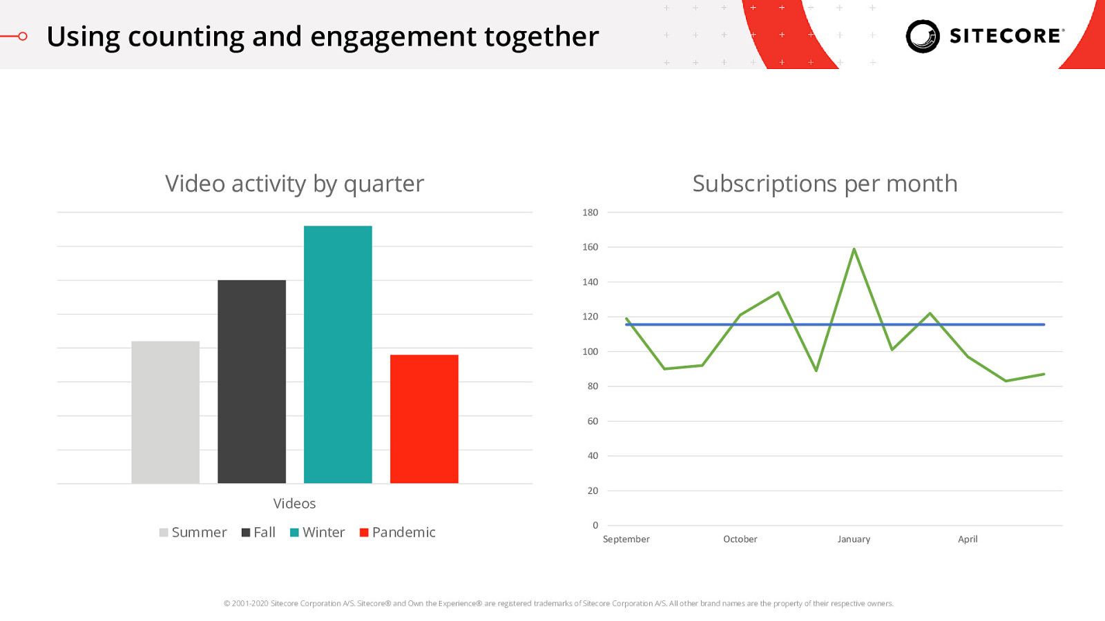
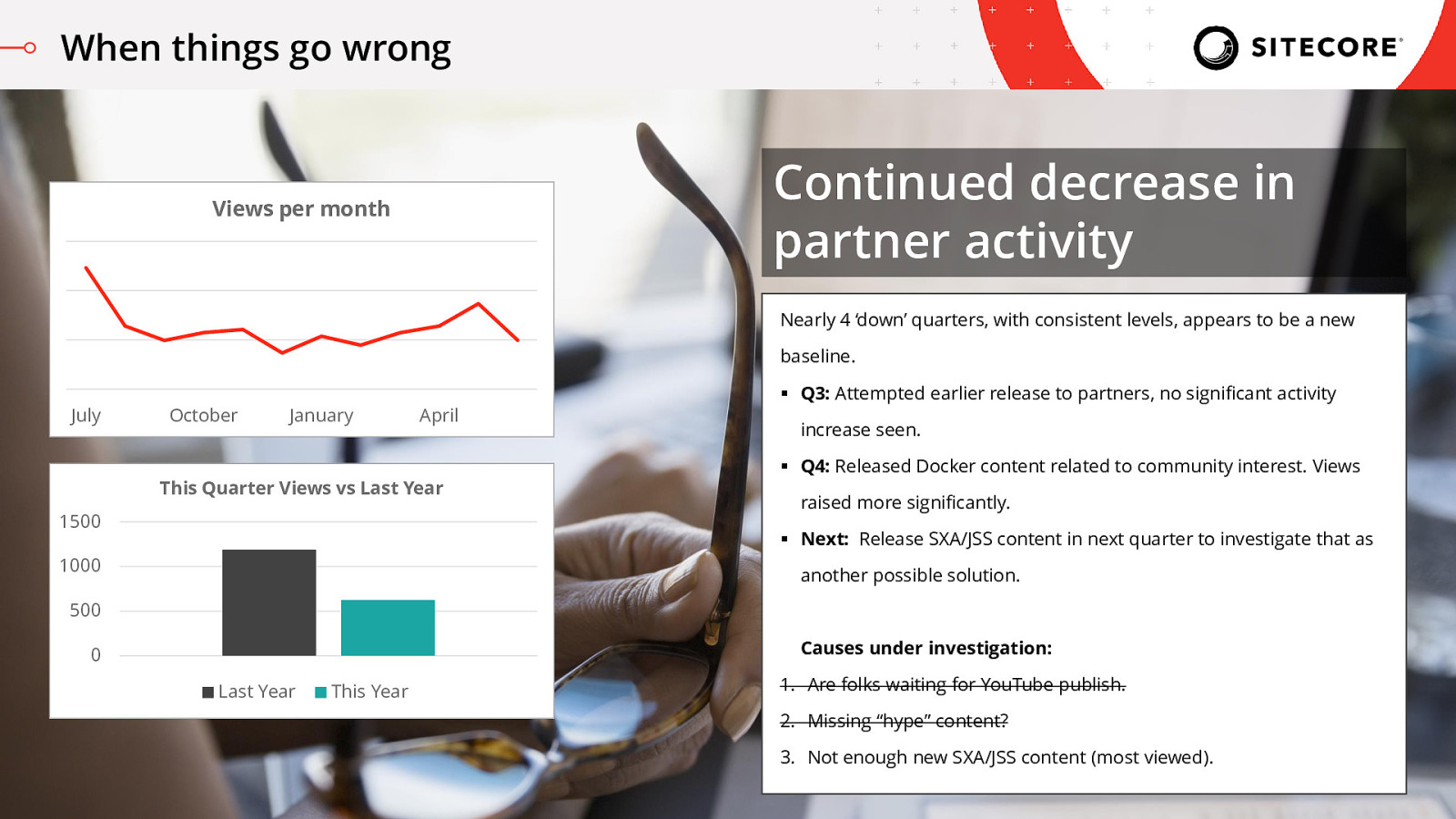
So, for example, when I looked at the previous activity graph it looked like our Decks output went up, but really it is the same as what we did last year. Similarly, it felt like our videos took a sharp nose-dive versus the previous quarter, but we’re actually up compared to last year, so it feels like maybe that isn’t an issue.
However, between both graphs I can see that the Docs and Presentations changes seem to be outliers. Worth looking into.
Lesson #3: Comparing against the ‘same thing’ across years is helpful to look for changes in seasonal activity levels. This type of graph will help you identify something strange that doesn’t normally happen at that time of year.

